Service: UX Design & Graphic Design
Timeline: 3 months | Finished March 2024
Deliverable: App Design
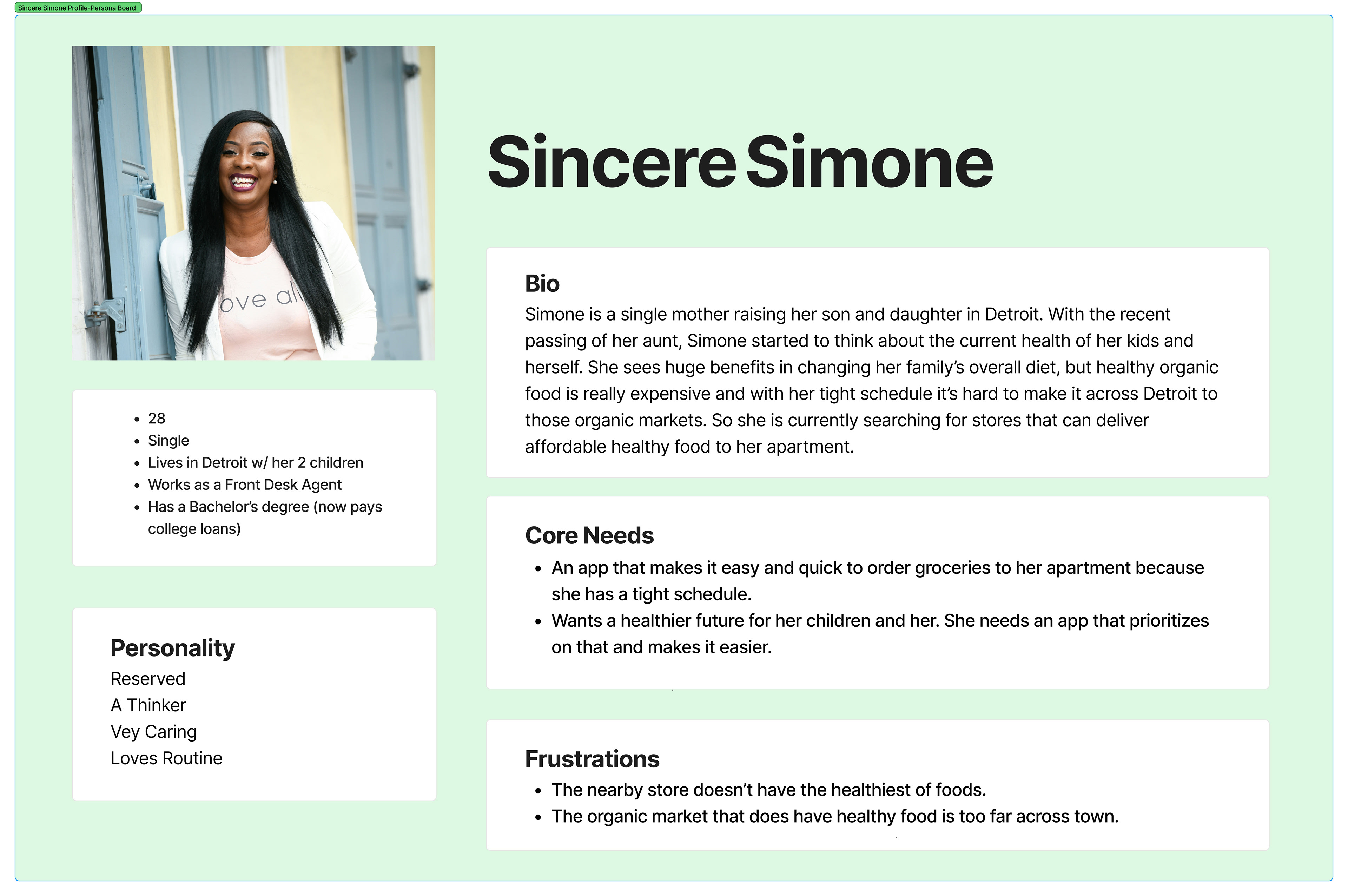
Problem: How can we make Organic Food more accessible for low to mid-income families & people in need of a diet change due to underlying health conditions?
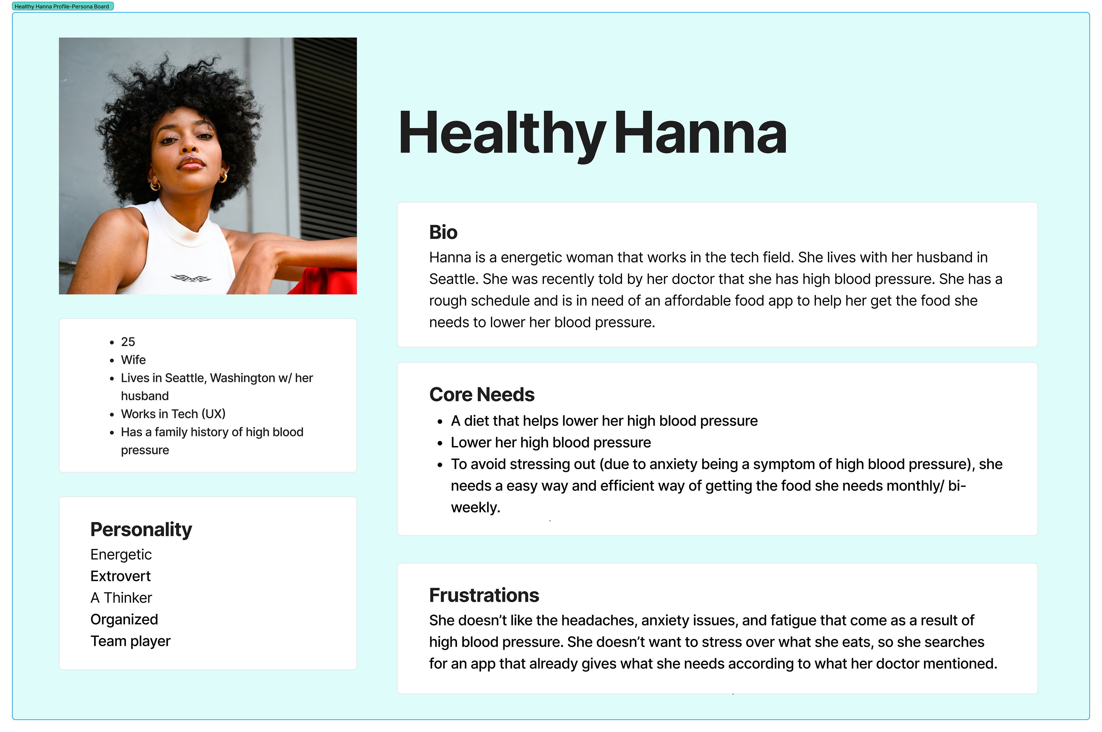
There's a common saying, "You are what you eat." It might sound weird on the surface, but under its presentation, it holds a truth that affects our physical and mental health. Access to healthy organic foods can do the trick and help many, however, it isn't that easy to access them. Around 15.8 million children in the U.S. in single-mother households (average salary of $46,565) are affected by the high prices of organic food, as well as people told by doctors to change their diet due to a health condition.
This app helps make organic food more accessible to both groups by providing an online food market that's quick/easy to use when on the go and by providing a resource to customize diet plans for people healing from health condition symptoms. By addressing affordability, functionality, and personalized nutrition, the app empowers users to make healthier choices for themselves and future generations.
Exploring the User Experience
User Flow: Creating an Account
User Flow: Setting Up Autoship Feature (w/ an Existing Account)
Implementing User Needs
This food market app provides affordable organic and healthy foods while offering convenient features like an auto-ship option, ensuring busy single mothers never run out of essential groceries. It also includes a personalized questionnaire for users with health concerns, generating tailored dietary recommendations based on their symptoms and conditions. With a seamless shopping experience and health-focused guidance, the app makes healthy living more accessible and stress-free for those who need it most.
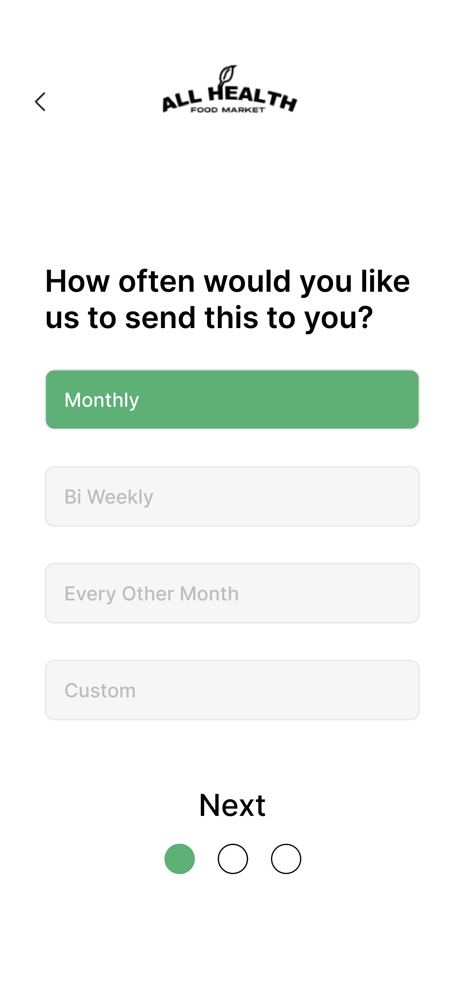
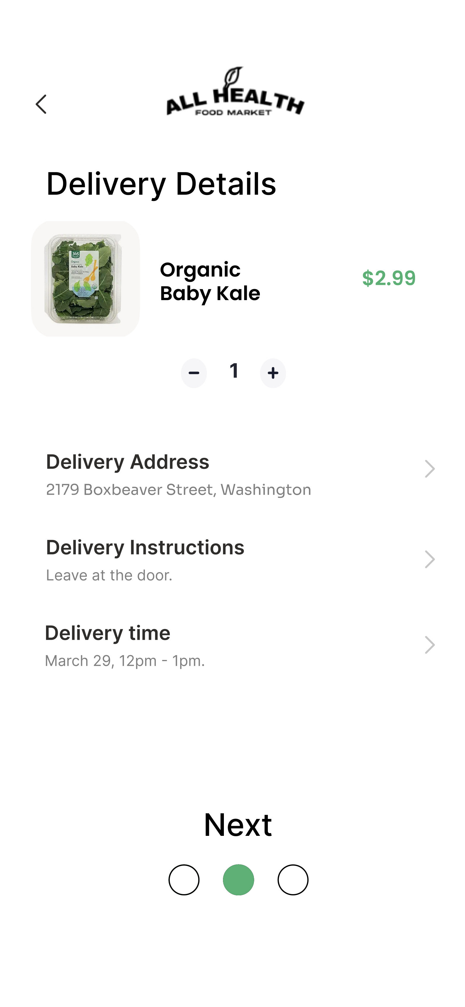
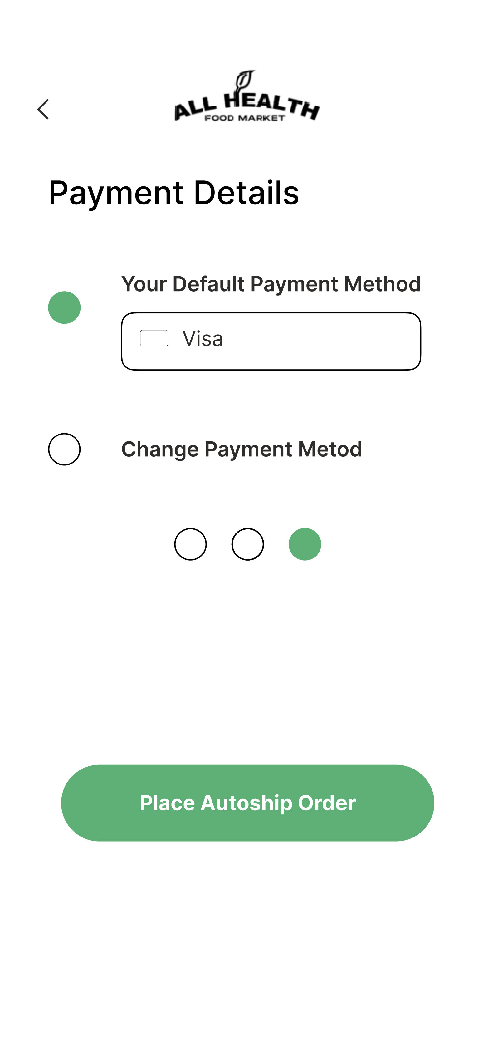
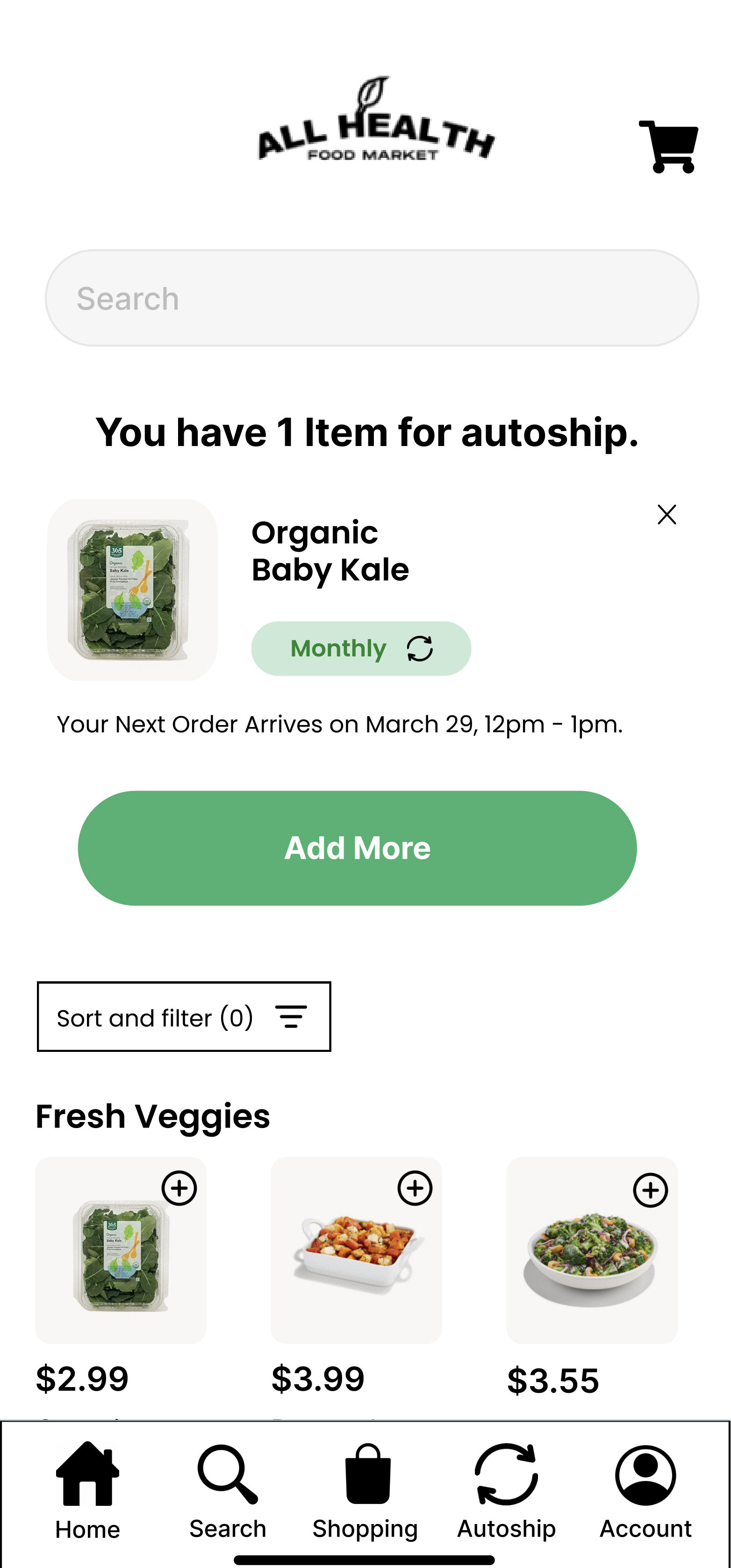
Autoship Implementation
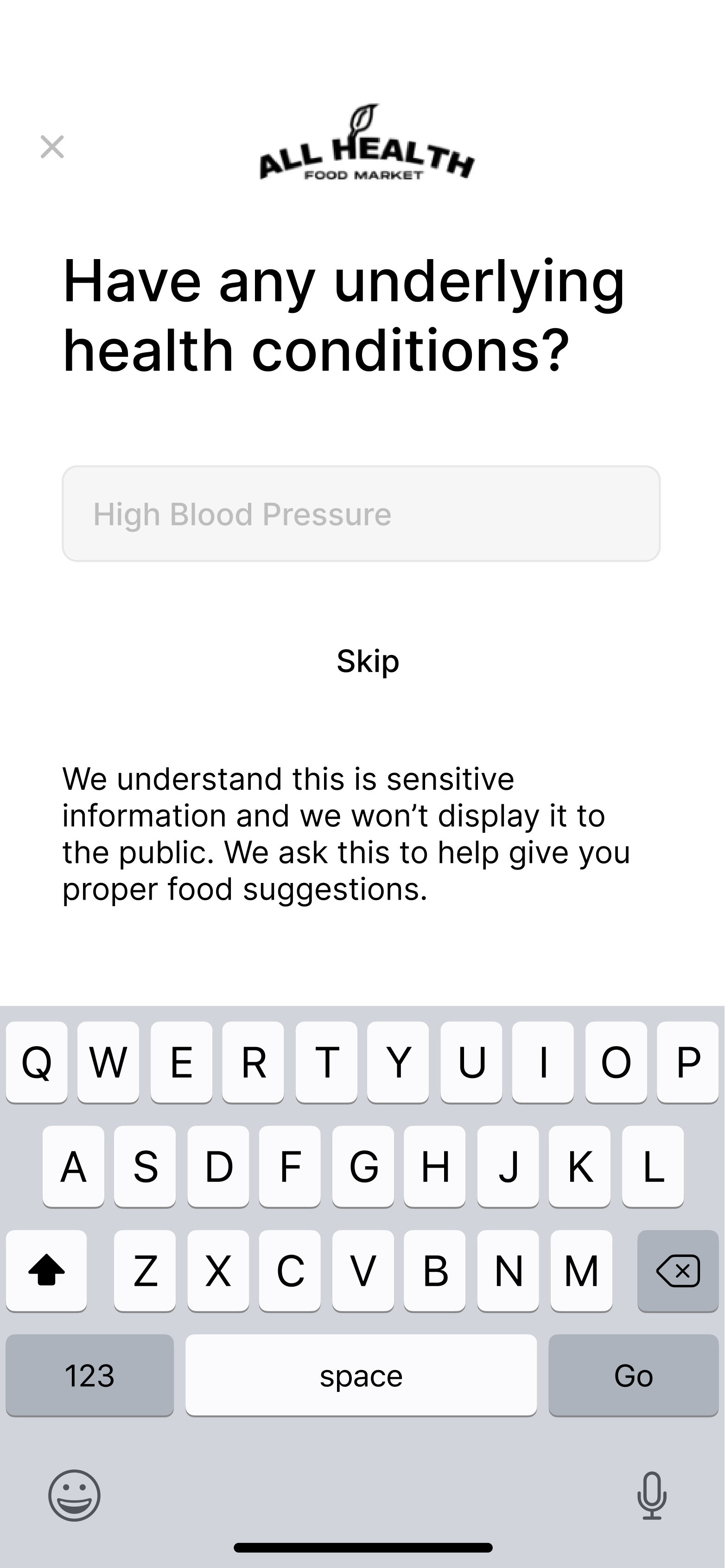
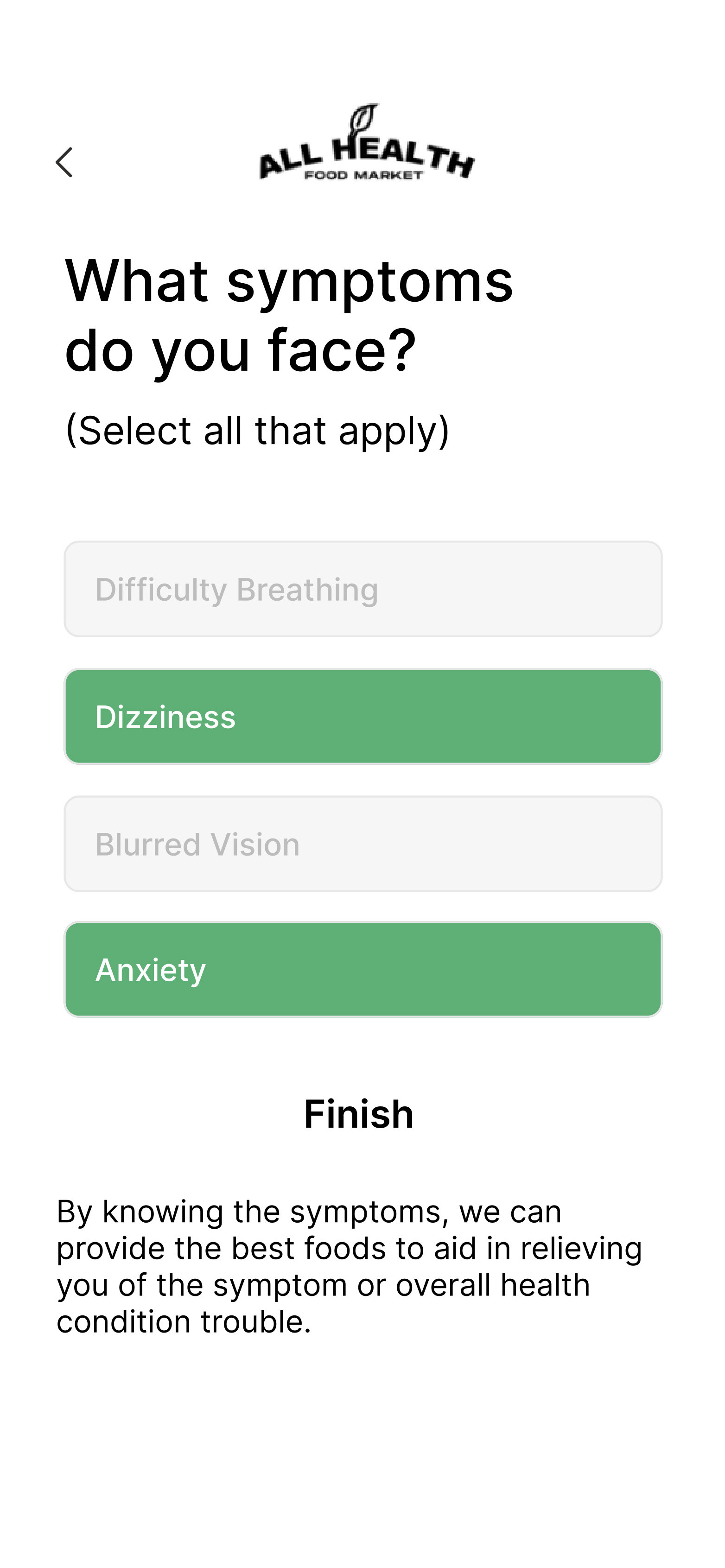
Health Questionaire Implementation
